As a professional photographer, I get asked this question all of the time.
“What should I wear for my portraits?”
This question comes with a variety of different answers, but my main focus when I help plan a High School Seniors clothing options, is to make sure they are going to look, and feel, their best during our session together. I want them to convey their style and who they are, but in a way that feels good to them.
There are 3 main tips I start with when I help discuss wardrobe with my clients.
1.) Be comfortable. It is so important to be comfortable in your clothes during your session. If you don’t normally wear 5 inch heels, I don’t recommend going out and buying some, even if they are the hot new item. You will feel awkward, and it will inevitably show in your photos.
2.) Make sure your clothes fit properly. This is very important because this can make or break your pics. If you have clothes that are too tight(even just a little), they will bulge in places that you don’t want them to. On the opposite end, if the clothes are too big, they will add weight to you in your photographs. Having a proper fit will ensure you show off the best parts of your body.
3.) Be stylish, but not trendy. Remember those amazing 80’s and even 90’s outfits? As much as we loved them at the time, I don’t want you to look back at your photos and say, “What was I thinking!?!?!” Pick things that will show your style, but not put you in the trendy category. (Sorry N’Sync, love you, but what is with those overalls?)
The next thing you can do to make yourself glow in your portraits, is to pick clothes that compliment your skin tone.
“But Carrie, I don’t know how to figure out my skin tone. Whats the magic formula?”.
Lucky for us, when you are trying to choose for your skin tone, you only need to worry about your UNDERTONE. And there are only two; Cool tone and Warm tone.(There is actually a 3rd, Neutral-we’ll talk about that later) Don't know how to figure it out? Here is a quick tip. Flip your hand over, and look at the underside of your wrist. What color are your veins? If they are blue or purple toned, then you are cool toned, if they are green or have a yellow cast, then you are warmed toned. It's that simple!
Picking main colors will be simple now. If you are Cool tone, then choose colors that compliment your tone in the cool region like whites, black, blue, grey, and silver is your metallic color you are going to go to. Warm tones will stick to more "earthy tones" like burnt orange, brown, red maple leaf, purple and Gold is the metallic you will go to. This is just a starting point.
“Carrie, I want to add some COLOR to my wardrobe. What do I do now?”
Well this is where the color wheel is your friend and getting to know the way the colors work together will be a HUGE benefit to you! Color mixing has been a big trend over the last few years, so you can now learn how to be a part of that trend! The color wheel is split up into two sides. A cool side, and warm side. Pick any color...go directly across the color wheel to the opposite side. This color is a complimentary color to the one you started with. Like Red is complimentary to Green(Christmas anyone?) Now choose that same color, and pick two colors on either side of it. These are the colors analogous colors. So Red’s analogous colors would be purple and orange.
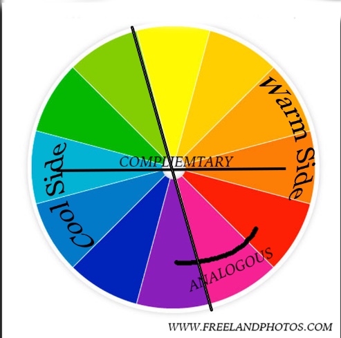
To add the colors into your clothes, start by picking a few of your favorite shades from your color group and make these your main colors .When mixing up your wardrobe, start by looking at the complimentary colors(the ones right across from each other). For example, if you are cool toned, use cool tones for earrings, top, or necklace, and then add the complimentary warm shade on the bottom or shoes. If you want to stay on the analogous side of the color wheel, then you would stick to your side to ensure the best possible palette for your skin. So if you are warm toned, stay with magenta, red and purple. Tip: Keep the color that works best with your skin tone closest to your face, so that you look amazing in your portraits:)
I have a fun tip to remember the color wheel, so you don’t always need to have it on you. Think of the phrase “Really Young Guys(or Girls) Can Be Mistakes.” (Red, Yellow, Green, Cyan, Blue, Magenta). This is the main colors of the wheel, however there can be a lot more added to the wheel in the form of tertiary colors, but this is a great starting place.
This week I went over a high school seniors wardrobe on periscope. Don't know what periscope is...Go check it out. It's a live broadcast social media, where you can see and interact with people in REAL TIME! I aboslutely LOVE it and will be doing one every week!! You can follow me here
Watch this video to catch the replay!
How to choose clothing for your portraits-Colors that fit your skin tone. from Carrie Stadelman on Vimeo.
Now you are equipped with the starting points on picking clothes that will make you shine in your portraits. But most importantly, remember to love yourself, and who you are. No matter what clothes you put on, feeling confident in yourself, and what you stand for will ultimately show in your portraits making them genuinely beautiful and genuinely YOU!:)
Note: There is another undertone: Neutral. This is where your veins are blue/green. You would wear colors in the middle of the color spectrum/tones of the color wheel:)